Comparison
LaFoto vs Ideogram: typography against photography
Most image models learn images as texture rather than as symbols, which is why lettering comes back looking convincing and spelling something else. Ideogram made that problem its focus and solved it well enough that it became the reason people use it.
That focus is also its boundary. Typography strength does not transfer to photorealism, and a poster tool is not the same as a tool for producing a portrait or a product shot that has to match a physical object.
At a glance
Comparison facts are sourced and dated below. LaFoto is pre-launch; its column describes design intent.
| LaFoto | Ideogram | |
|---|---|---|
| Primary strength | Photographic output with editing built in | Legible text and typography inside images |
| Text rendering | Routed to a text-capable model for logo work | Best in class across the category |
| Best suited to | Portraits, products, real-world imagery | Posters, packaging, ads, anything with words |
| Editing model | Masked edits preserve the rest of the frame | Magic Fill and editing tools |
| Free tier | Free to start, no watermark | Limited free tier (reported) |
| Status | Pre-launch, launching 2026 | Available today |
Where LaFoto fits
- Photographic defaults and real optical vocabulary.
- Masked editing that preserves everything outside the selection.
- A text-capable model routed in specifically for logo and mark work.
- General-purpose rather than optimised for one output type.
Where Ideogram fits
- The strongest text and typography rendering available.
- Reliable for posters, packaging and advertising layouts.
- Available today with an established user base.
- Strong prompt adherence on graphic and layout-driven work.
What LaFoto is built to make
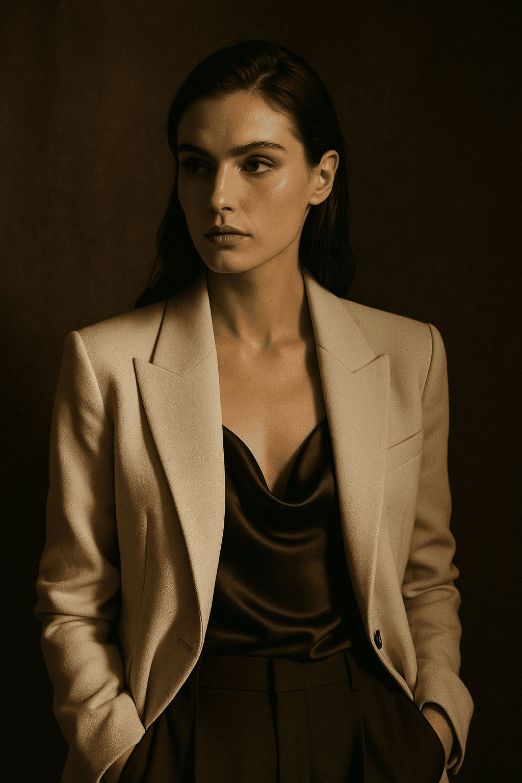

The verdict
Choose Ideogram if words appear in the image. Nothing else in the category matches it for legible type, and no amount of photographic quality compensates for a headline that is misspelled.
Choose LaFoto if the image is a photograph and any text is added afterwards in a layout tool — which is how most professional work is actually produced. LaFoto is pre-launch, so Ideogram is the available option today.
Frequently asked questions
- Is Ideogram better for text in images?
- Yes, clearly. It is the strongest option in the category for rendering legible type, and that is the specific problem it was built to solve.
- Why do most AI generators get text wrong?
- They learn images as texture and structure rather than as symbolic systems. Letters are symbolic, so "nearly right" is simply wrong, which is why logos come back reading almost-but-not-quite correctly.
- Is Ideogram free?
- There is a limited free tier, with paid plans reported from around $7 a month. Check the current pricing page, as tiers in this category change often.
- Can LaFoto render text?
- Logo work is routed to a text-capable model for exactly this reason. For a poster or packaging layout with substantial copy, a typography-first tool remains the better choice.
- Which is better for social media graphics?
- If the graphic carries a headline, Ideogram. If it is a photograph that a caption sits beside, LaFoto — and in practice many people use one for the image and a layout tool for the words.
- Do they use the same underlying model?
- No. Both are proprietary and tuned differently — Ideogram toward glyph rendering and layout adherence, LaFoto toward photographic realism and editability.
Sources
- 01Ideogram pricing — Ideogram (accessed 2026-06-01)
- 02Ideogram product overview — Ideogram (accessed 2026-06-01)
LaFoto and Ideogram side by side
- Ideogram’s focus
- Legible text inside images
- LaFoto’s focus
- Photographic output
- Best for
- Posters, logos, signage mock-ups
- Weaker at
- Photorealism, comparatively
- Overlap
- Narrow but real
- Verdict
- Depends on whether words matter
Typography against photography
Text was the last hard problem, and it was theirs first
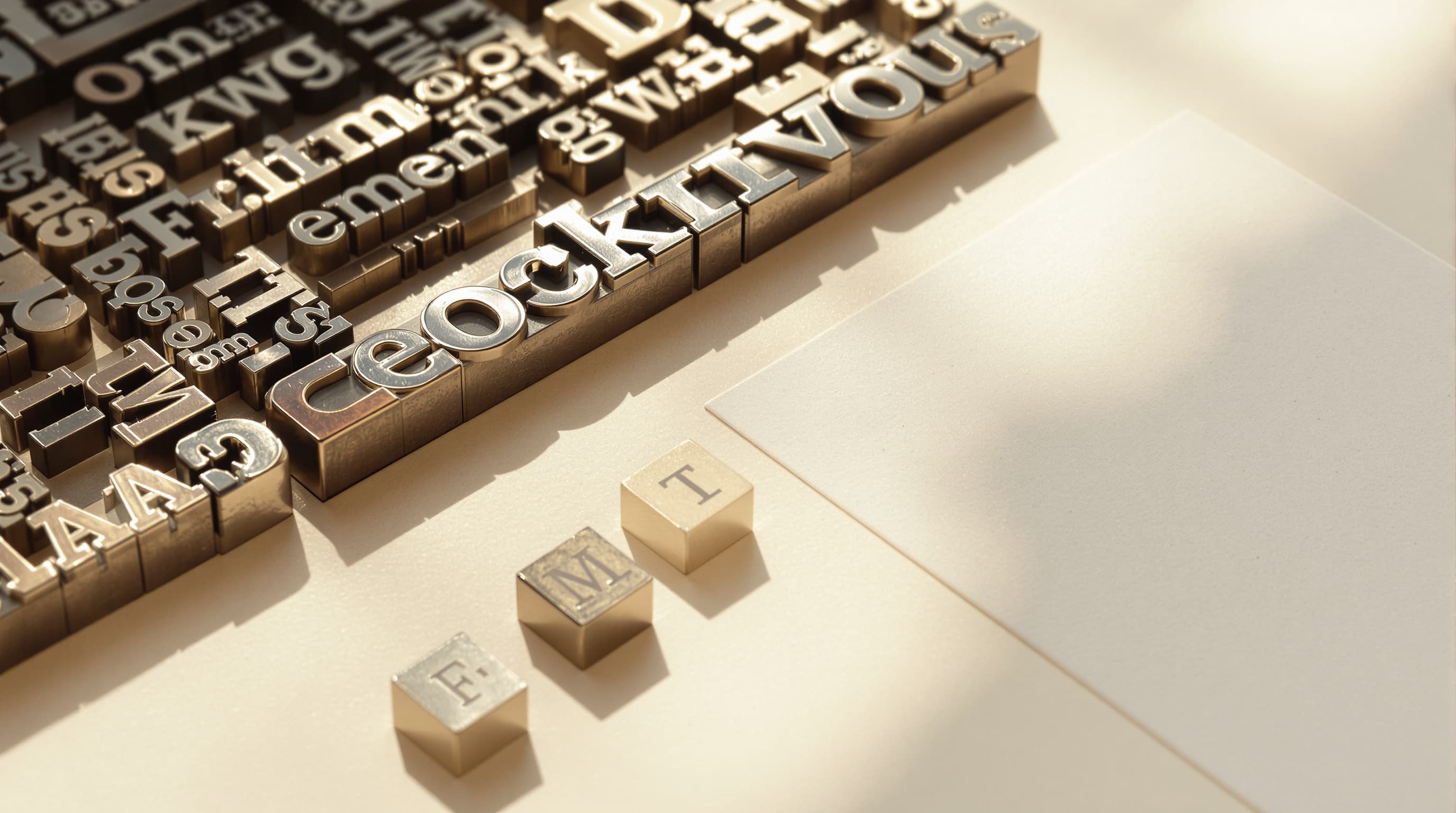
Legible lettering was for years the reliable way to spot a generated image. Models assembled letter shapes from visual statistics rather than spelling anything, and signage came out as confident gibberish.
Ideogram made that its specialism before the general-purpose models caught up, and it is still among the most dependable for a headline that has to be spelled correctly. If your output is a poster, that is the whole argument.
Decide by the deliverable
Does the image contain words?
Posters, mock-ups, signage
A headline that must be spelled correctly, a mocked-up shopfront, a book cover concept, a packaging comp. Text-first models are meaningfully better here.
Even so: generate the picture and set the final type properly. Generated lettering cannot be re-kerned, corrected or translated later.
- Short strings are dependable.
- Long passages still fail everywhere.
- Set final type in a design tool.
Portraits, products, scenes
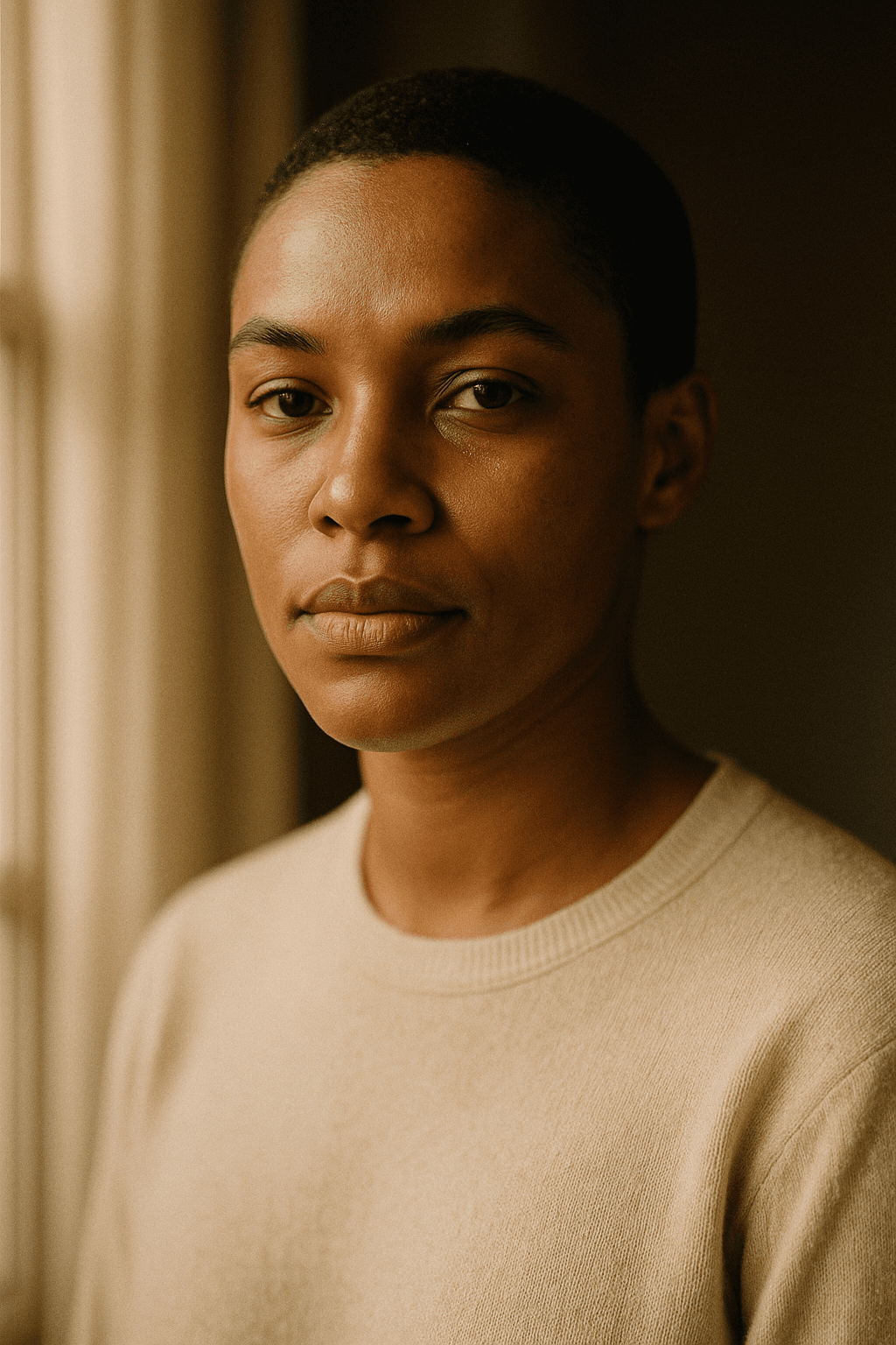
A photographic image with no lettering in it. Here a model tuned for text is spending capacity on something your brief never asks for.
Skin, light falloff and lens character are the tests, and they are where the difference is visible.
- No text in the deliverable.
- Photographic detail is the test.
- A photography-first model.
The case that is neither
A mark is typography plus form plus, usually, a vector file at the end. A raster generator of any kind gets you a concept rather than an asset.
Generate the concept wherever it looks best; the format problem is separate and comes for everyone.
- Concept, not final asset.
- Print and signage need vectors.
- See the logo page for the full route.
Ideogram questions
What people ask
Almost all of it comes down to whether the image has words in it.
Is Ideogram better at text?
It specialised in it early and is still among the most dependable for short strings. General models have narrowed the gap considerably.
Can any model set a paragraph?
No. Short strings are reliable, long passages degrade everywhere, and none of them are typesetting engines.
Should I generate text or add it later?
Add it later whenever the words are final. Generated lettering cannot be edited, spell-checked or translated without regenerating the whole image.
Which is better for photorealism?
A model tuned for photographic output. Specialising in typography costs capacity that would otherwise go to skin, fabric and light.
Do I need both?
Only if you regularly produce both posters and photography. Most people produce mostly one.
What about non-Latin scripts?
Much harder, and a different specialism again — Chinese characters differ by single strokes. See the Seedream entry in the model directory.
Keep exploring
Elsewhere on LaFoto
Most briefs do not contain words. These are for those.
- resize an image
- image converter
- compress an image
- crop to a ratio
- image colour palette
- cut out a subject
- check EXIF data
- AI prompt generator
- anime AI generator
- cartoonize a picture
- pixel art generator
- which generator to pick
- compared with Midjourney
- Leonardo AI alternative
- LaFoto vs Ideogram
- Canva alternative for images
- what is a seed
- denoise strength explained
- what is inpainting
- guides and explainers
Start creating today
Generate your first image with the best AI image generator.
Turn a sentence into a finished, photorealistic image in seconds — then refine every detail. No setup, no Discord, no GPU.
Join 4,200+ creators using LaFoto